Tuesday, August 28, 2012

Paper Bag Banner


I used to craft cute stuff for my classroom during the summer and then spend a week (or 2) before school started organizing my classroom. I always taught the little kids and they just need so many tangible learning tools. Of course I HAD to make them all cute! LOL I miss that part a little.

I had an idea for a cute little banner for school. It is a brown paper bag banner. I cut a notch from the bottom of the bag to make a dovetail banner shape. Then I took a page from a top bound spiral notebook. I cleaned the edges because I hate the little hanging tabs then turned it upside down.

The next layer is just yellow cardstock that I edged with a scalloped Fiskars punch.
The patterned paper is something I got AGES ago for a classroom project. I figured it was time to use it up. LOL

I used some letters and school cut files to embellish.

Finally, I topped each bag with a paper doily and added a cute little paper bow.
I thought this would be really cute for one of my teacher friends to hang in her classroom.

Saturday, August 25, 2012

Box card for Ty

Well I am still behind on my birthday card. This one is for my nephew. I wanted to make a card that felt young and had a little surprise.
It is a box card that opens up. I have to tweak the cut files a little before I do a tutorial on it.
If you just can't wait, there are several videos showing how to make them on YouTube.
Just search for Box Card Tutorial.


I used K & Co paper and a little Tim Holtz Coredination paper.

About the beaded butterfly on my last project, yes I did make it. When I feel better I will make a video on that as well.

Happy crafting.

Tuesday, August 21, 2012

I Feel The Love - Olivia

I am sure most of you have seen Madison's blog called Funky Cards. She has a project every month called I Feel The Love (IFTL) and has even started a separate blog for I Feel the Love. She selects a child or group of children that need some extra love and encouragement to deal with the difficult illness, disability, or situation that life has dealt them. 

I have been thrilled to participate for the last couple of projects but I waited until the end of the month and had to rush to get my projects to her on time. I did not get pictures or post about them.

This month, Madison has shared the story of a precious 9 year old girl named Olivia. She lost  her mom to cancer last year and has started a group called Kids Involved in Caner Research to raise awareness and funds for colon and lung cancer,

I made a card to send to Olivia to encourage her and tell her how awesome she is.


I used some Echo Park Hello Summer paper and added some of my "pretty flowers" and a glittery letter "O".  Since the butterflies on the paper were so cheerful, I decided to add another one that was beaded. 

If you would like to make a card for Olivia, you can check out one of Madison's blogs,
Funky Cards or I Feel The Love

Monday, August 20, 2012

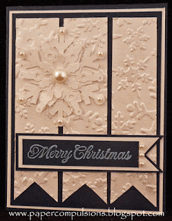
Snowflake Cards

Well I have been working on some Christmas cards. I wanted to get started now so I am not rushed later. I noticed that Jingle Belles over at http://jinglebellesrock.blogspot.com/ have challenges to encourage people to do just that. They have Christmas card challenges all year long. What a great idea.

This week they are having a sketch challenge. Here is my interpretation of the sketch. 


I turned the center panels into banners and embossed them with a Sizzix embossing folder. It does not really show in the top picture, but I added sparkly pearl dust on the panels to make them shimmer.


The sentiment was stamped and matted but it was bigger than I expected so I just made it go all the way across. I added some snowflakes from my cut files and a few pearls. 

The top card will be entered in the Jingle Belles sketch challenge. 
I played around with the idea a little more with the next two cards.


I changed the layout then tried it in vellum.


 I think I like the top one most, but the good thing is I can use them all. :)

Sunday, August 19, 2012

Little Birdie


I needed a quick little card. I decided to play with the Echo Park For the Record papers I got recently. I used the cute little sticker birdie and some of the letter stickers to spell out "hello". The caption needed some weight so I cut a little tab from some of the patterned paper and made a little tab. As finishing touches, I added a sticker trim and some light blue bling.


Tuesday, August 14, 2012

Aged Mahogany Roses


Well August is a busy month for me with all the family birthdays. This card is for my MIL. With all the cards I give my make for the women in my family, sometimes I have to try hard to come up with new ideas. This Mariposa paper from K and Co. made it easy this time. The paper is so pretty that I just added some of my Open Roses and a Diamond edged border and I was done.  I did stamp a butterfly and color it, but it just did not look right when I placed it next to the butterflies that were already printed on the paper. No worries.  I just added it to the inside of the card.


I used Aged Mahogany Distress Ink and stain to color the ribbon and flowers. It matched very well.

Sunday, August 12, 2012

Adding On and On

Ever get an idea for a card in your head and when you start to make it, it evolves into something quite different? That happens to me quite a bit. Sometimes seeing the actual card brings other ideas to mind. Sometimes I just have to fix mistakes and cover things up. I had to fix a lot of little mistakes on this card. I like how it turned out though.


 I made this card for one of my SILs for her birthday. It started out much differently. I was going to focus on the Pink Paislee London Market papers. Then I decided to stamp a sentiment. I was even going to be brave and stamp directly on the the card. Big mistake. I should have known that never works for me. So I put the flowers on the left side to cover up the stamp. Then the card was out of balance and I needed to add something to the right side. LOL  (I used my good old faithful Tattered Flower, Pretty Flowers, and Detailed Butterfly)

So I ended up with a different design than I intended, but it is still just as pretty. I guess that is all just part of the creative process. :)

The original idea for the card would have fit into a regular envelope. With all the changes I ended up needing a bubble envelope. I decided to stamp on the regular envelope...then it needed coloring because it looked too plain...then I needed to add more...decided to doodle...then add glitter glue...

I finally just had to quit and mail the card. 
It has not made it to my SIL yet so I guess this card is still on it's little journey...LOL

Friday, August 10, 2012

New Teresa Collins Stamp


Ok, please tell me I am not the only one watching all the Summer CHA videos on You Tube. It is SO addicting! So many good things in one location. Wow!

Well, I am not usually an impulse buyer. I usually shop around for all the similar items to find the best deal. I analyze all the pros and cons and think about it for a while. (Frustrates my hubby sometimes because I do not make decisions very quickly and he wants to rush through it all. Hopefully we balance each other with our differences :) Anyway...When I saw this new Teresa Collins stamp, I had to have it. I opened a new tab and bought it right away. Something about it just spoke to me. I love it,

I have lots of plans for this stamp, but here is what I came up with first.


I added some bling, glitter, and one of my Open Roses. 
I added some pink glitter to the leaves because....well it is PRETTY! LOL
The Bling on a Roll from Michael's is clear with the hearts and a small rhinestone between them. I added two rows of pink stones for a little more interest. ( If a little bling is good...more is better,,,right?)

Here are some shots of just the stamp.


So Pretty!
It is large too. This image fits well on an A2 card. It would be great on scrapbook pages too.

Oh, I also got a free BONUS with my order...
 PRIMA! Wow it must be cool...


... after all, Prima is always wonderful... right?

Here is what I received.

ROFL!
If they only knew the kind of flowers I make, I bet they would laugh too! :)

Thursday, August 9, 2012

Motorcycle Silhouette


Well my crafty friends, we all know how difficult it is to make masculine cards. I mean if you take away our flowers, ribbon, and bling and we don't know what to do. LOL

These silhouette cards I have been doing lately are perfect though. I just blend Scattered Straw, Wild Honey, and Barn Door distress inks together on Gloss card stock then cut out my images in black. Yes, I do spend a lot of time making the cut files first, but I am not counting that :)

This card is for my brother in law. He does not hunt so the wildlife silhouettes would not have worked. He does have a really cool motorcycle though. His bike is so nice that a simple one layer silhouette did not do it justice. I added in some details. (You know how I love details). I also added some glossy accents to parts of the bike that are shiny. 

I am not sure how common this outline is, but if you would like the cut file for it just email me and I will send it to you. papercompulsions@gmail.com

Tuesday, August 7, 2012

Not quite a business card

I do not get out that often, but people are always asking my hubby and son for my blog site or Etsy shop name. I thought I would make some cards with my information on them. They turned out a little bigger than a business card or ATC. They should still do the trick though. LOL


Look at the detailed cuts in that butterfly! Man, I love my cutting machine.

Friday, August 3, 2012

Crabby Pals for Make the Cut Challenge

I am a featured designer this week for the Make The Cut challenge! (yeah)
I designed these cute little Crabby Pals cut files in honor of the occasion.

You can download the cut files and assembly guide here.
You can use the red crab or the hermit crab or both of these cute little crustaceans.

They go together really easily.

Here is a card I made for a little inspiration. 


The patterned papers are from Echo Park's Hello Summer line designed by Lori Whitlock.
I think they add a perfect cheerful Summer time feeling.


For the sand and sea layers, I tore strips of kraft and Core-dinations papers. The strips only have adhesive on three sides so they make little pockets. That way the crab and flip flops can be moved around. 


The umbrella and sun are printed stickers that I raised with pop dots. (I put a little powder on the back of the stickers so it would neutralize the adhesive and not stick to the actual card.) The umbrella has pop dots in the center and is attached to the card on the top and both sides. It looks like it is opening up right off the page.


The flip flops have tiny ribbon going through them. SO cute!


Hop on over to The Make The Cut Forum to join in on the challenge.

Thursday, August 2, 2012

Distress Ink Reference Cards

Well, I have been so busy that I did not even get pictures of my last 2 projects before they had to be mailed. Don't you just hate that. Oh well, I still have lots more projects planned so it is ok.


Now what I am sharing today is a work in progress. I have worked on it off and on for the past couple of weeks. It will probably take another week or so before I am finished. 


I am making reference cards for all the Tim Holtz Distress Products that I have. 


 Yes, it is a lot of work, but I found myself having to sample 3 or 4 products on white cardstock for almost every project I make. This should actually save time in the end. (at least that is what I am telling myself) LOL


If I do not have a product in a certain color I just blend ink on that area then make a note of the colors and items I still need to purchase. (I had lost track anyway)
For example, the Evergreen Bough is a Winter seasonal ink so I do not have the marker or stain to go with it.


While I am at it...If there is a certain combination of ink colors that I like to use to match certain lines of patterned paper, I make a little note of that on a thin strip of paper and put it on the ring with the rest of the cards.

Now the next time I am working on something, I can pull out my cards and decide exactly what color Distress inks, stains, or markers that I want.
And too, there is just something kinda cool about looking at this ring full of beautifully colored cards. :)